Friday 13 May 2016

Chapter Four - Cut and Fold Designs 

Symmetrical Designs

I really enjoyed this chapter and was both surprised and delighted by the myriad of designs that can be created using this method. I liked the element of surprise, particularly with the more complex designs that were created with multiple folds and cuts. 

I decided to use coloured backgrounds rather than white but still keeping to my basic colour scheme of red and green; in this case I mixed light pink for the symmetrical designs and and light green for the asymmetrical designs. I decided to use my white, folded practice papers to show how I had created the designs so I needed coloured background for the practice papers to show up.  

The practice papers served a dual purpose:- 
a) I wouldn't need to draw out the designs to show how I had created them - especially the asymmetrical designs as they were more complex and 
b) I would also have a paper template if I needed to recreate the design accurately.  
Please note however, there are no paper patterns for the later asymmetrical designs as they were created by random folds and cuts - no practice papers and almost impossible to draw. 

Unfortunately, it was only after everything had been stuck down and the images scanned that I realised some of the green backgrounds weren't strong enough and on these sheets the practice papers don't show up very well.  In hindsight I should have stuck to black and white and just drawn the designs..................but then hindsight is a wonderful thing!  


Sheet 1A

1.  Shape from page 2 of my line drawings - positive and negative shapes shown.  
2.  Similar shape but much wider but turned round to form a square, more squat shape.
3   As above but petals more elongated and thinner. 
4.  Similar to No. 2 but an outline rather than a solid shape.


Sheet 1B

5.  Outline of narrower design.
6.  Pieces that were left from cutting No 5. 
7. First attempt to create No 5 but I cut in the wrong place and ended up with two unconnected curvy lines.  Happy accident - I really like this one!
8.  Variation of the design - more angular and with a hole in the centre.


Sheet 1C

9.  Continuing with curved petal shapes I developed the idea of making double petals - more interesting design and has some movement.
10. Idea for this design is loosely based on one of my line drawings on sheet 2 - shield shape, bottom right.  I have added complexity to a circular design by adding further curved lines and an oval hole in the centre. This space leaves scope for further design elements - stitching or adding other shapes.


Sheet 1D

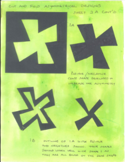
11.  Basic diagonal cross shape with rectangular hole in the centre.  Design idea based on several of my line drawings that contain a cross/windmill shape.
12.  Cross shape in two directions - could be called a star!


Sheet 1E

13.  Design loosely based on drawing of a broken window on sheet 1.  The square in the centre represents the window with the jagged panes of glass around it on all sides.
14.  This isn't based on any of my line drawings but, as it is only symmetrical diagonally, it is a more interesting design and another favourite.


Sheet 1F

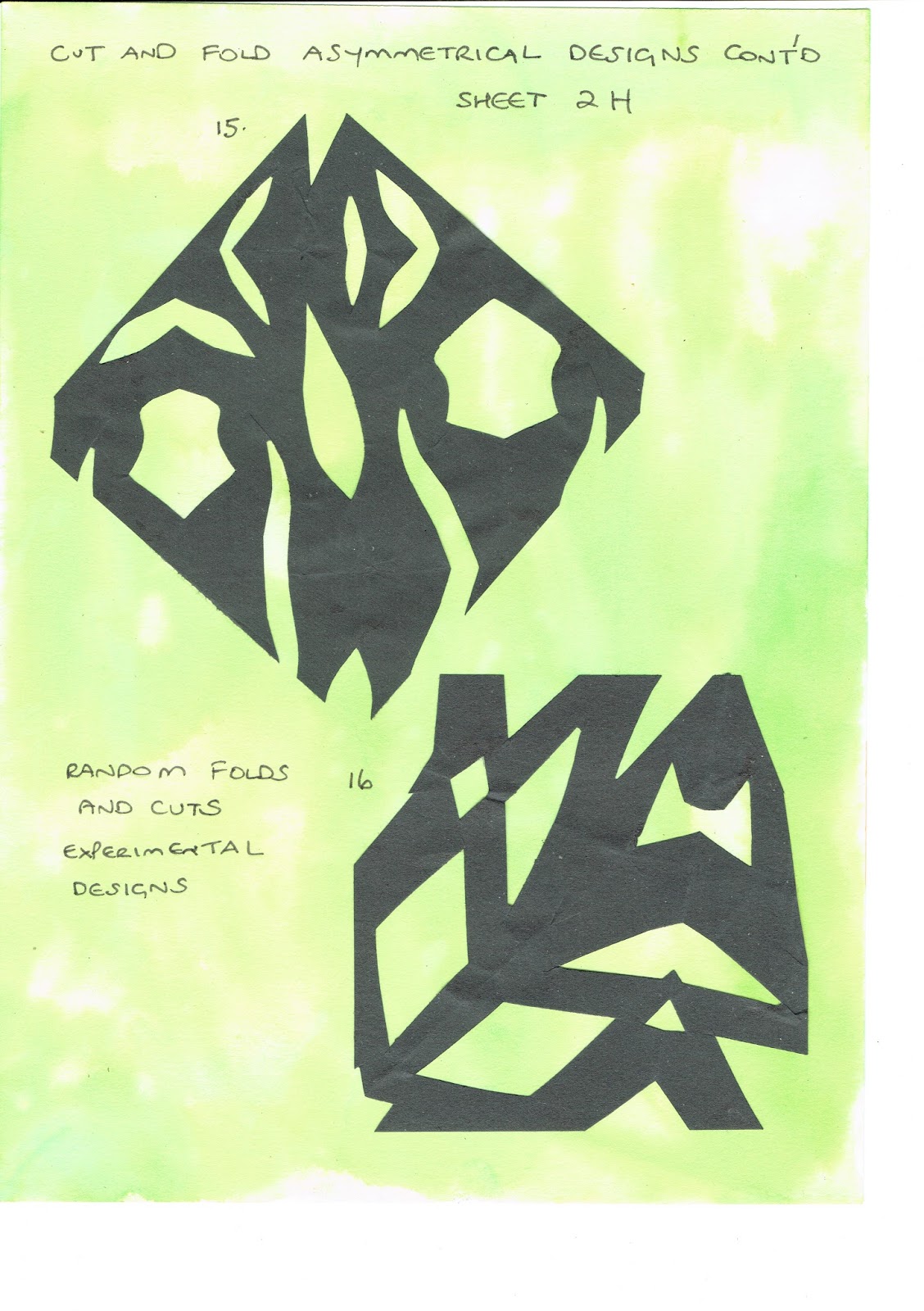
15 & 16  More diagonal designs, not based on specific line drawings but random developments of earlier, more basic cross shapes.


Sheet 1G

17.  This design contains elements of both No 10 and No 12.
18.  This design is the result of free cutting into a folded triangle and has created a lacy effect with a cross in the centre.


Sheet 1H

19.  Simple diagonal cross produces trellis like pattern.
20.  More complex version of No 19.  The top legs of the cross are widened and bottom legs have straight ends rather than pointed.  The angles of the cross have also been adjusted.


Sheet 1I

21.  Simple trellis pattern - open design created with long diamond shapes.
22.  Tighter trellis pattern - not so much negative space showing.


Sheet 1J

23.  Design based on drain cover line drawing on sheet 3.
24.  Further development of drain cover - more slits cut to create a more complex design.


Sheet 1K

25 & 26  Further designs based on drain cover drawing on sheet 3.  I prefer the more diagonal feel of these designs.


Thursday 12 May 2016


Chapter Four - Cut and Fold Designs

Asymmetrical Designs

Sheet 2A


1. Square folded into quarters - folds skewed so they don't line up, simple cross shape.
2. Folds as above.  Design based on symmetrical 1D.


Sheet 2A Cont'd


After completing all my designs I read the module brief again and felt I needed to develop one design a bit more. I selected sheet 2A and added some positive/negative asymmetrical shapes.


Sheet 2B


3 & 4  Folds as for 2A. Designs based on cross shape on Sheet 2A but with centres cut away.


Sheet 2C


5.  Square - corners folded into the centre but all folds are irregular and a few overlap.
6.  Folds as for Sheet 2A.  Design based on No.2 on Sheet 2A.  I like the sense of tension that has been created in this design.

Sheet 2D


7. Folded as for 2A - design based on design No 19 on sheet 1H.
8.  Square folded as for 2A then each side folded back to form a rectangle.  Design based on No. 22 on symmetrical sheet 1I.

Sheet 2E


9.   Folds as for No 2A.  Design based on No. 4 on symmetrical sheet 1A.
10. Folds as for No. 2A.  Design very loosely based on curved shapes on symmetrical sheet 1B.  I love this one - it reminds me of flowing water and I think the design has a Japanese feel.


Sheet 2F


11 & 12.  Folds as for No. 2A - designs based on No. 25 and 26 on symmetrical sheet 1K.  Design 11 has the look of a butterfly.


Sheet 2G


No. 13  Folds as for No 2A then sides folded back to form a rectangle.  Design loosely based on shapes in No 16 symmetrical sheet 1F.
No. 14  Square folded to form triangles and then folded back again - all folds irregular.  Design based on No.14 on symmetrical sheet 1E.  This is another favourite with lots of movement and interest.


Sheet 2H


No.15 & 16  Experimental designs with completely random folds and cuts.


Sheet 2I


No. 17 & 18 - more random folds and cuts.  I like design No.18, particularly the shapes created by the negative space.


Sheet 2J


No. 19 & 20 - more random folds and cuts.  No. 20 reminds me of an African tribal mask and I like the way the X shaped cross appears to be floating in front of the rest of the design.


Wednesday 11 May 2016

Chapter Four - Cut and Fold Paper 
Coloured Designs

I really enjoyed this exercise and felt I could have gone on forever.  I find it really therapeutic cutting out and arranging paper shapes as it is fascinating to explore the variety of designs and combinations that can be created with just a handful of paper cut outs.  However, in the interests of moving on to fabric and thread, I decided to stop after four sheets as I feel I am spending too much time on each chapter.

Unfortunately, I forgot to number each design before scanning the sheets in. As these sheets are A3 I needed to scan them at work, but it was only after I brought my sketchbook home I released I had omitted the numbers.  As an alternative, I have listed the position of the designs on each sheet so they can be easily identified. 

I have also described and referenced the individual layers of each design as follows:

  • Background
  • Middle - numbered according to the original sheet it appeared on.  (S) = Symmetrical  (A) = Asymmetrical
  • Top numbered as above

I prefer to work this way - detailing what I have done on my blog rather than handwriting the information on my sketchbook pages.


Sheet A
Top left: 
Background - lime green inked paper.
Middle - negative shapes left after cutting out No 2 (S) in dark red inked paper.
Top - No 1 (S) diamond cut out of the middle to break up the shape in red/white painted paper.

Top centre:
Background - green inked background lines drawn with a candle to create a resist.
Middle - negative shapes left after cutting out shape No 1 (S) - bright red water colour paper, dyed with Procion.
Top - No 9 (S) in lime green inked paper.

Top right: 
Background - light red painted paper.
Middle - No 25 (S) in green/red inked paper.
Top - No 7 (S) in dark green/red vellum.

Bottom left:
Background - mint green inked paper.
Middle - No 17 (S) in green marbled paper.
Top - No 7 (S) in red paper painted with Procion.

Bottom centre:
Background - green/red painted paper.
Middle - No 12 (S) in red/white sponged paper.
Top - No 6 (S) in red/green painted papers.

Bottom right: 
Background - green painted paper - not much of it is visible. 
Middle - No 2 (S) in lime green inked paper - centre square cut out.
Top - No 17 (S) in red painted newspaper.

My favourite two designs from this sheet are top right - I like the movement of the curvy lines and bottom centre - I find the mottled effect of the white/red sponged paper adds extra dimension to the design.


Sheet B

Top left:
Background - lime green inked paper.
Middle - No 9 but with wider lines in dark green marbled paper.
Top - No 12 (S) in red inked newsprint.

Top centre:
Background - red inked paper.
Middle - No 19 (S) in mint green inked paper.
Top - No 11 (S) - in green/red painted paper. 

Top right:
Background - pink paper - acrylic medium used as a resist. 
Middle - No 12 (S) in red painted paper.
Top - No 19 (S) in mint green inked paper.

Bottom left: 
Background - dark red painted paper.
Middle - No 23 (S) in red painted newspaper.
Top - No 19 (S) but cut wrongly (happy accident) in red/white painted paper.

Bottom centre:
Background - lime green inked paper.
Middle - No 25 (S) in red/green painted paper.
Top - No 11 (S) shape turned round in green marbled paper.

Bottom right:
Background - mint green inked paper.
Middle - No 20 (S) in red/green painted paper,
Top - No 12 but with diagonal lines only in red/white painted paper.

My favourite two designs from this sheet are top centre - a simple design but I think it looks nicely balanced and top right which is almost a more complex form of top centre. Both designs would work well in fabric and stitch.


Sheet C
Top left:
Background - red painted paper.
Middle - No 11 (S) in dark green marbled paper.
Top - No 16 (S) in pale green/white painted paper.

Top centre:
Background - mint green inked paper.
Middle - can't figure which design this is so can only imagine I have cut something the wrong way in dark green marbled paper. 
Top - No 8 (S) turned around in dark red painted paper.

Top right:
Background - red/green painted paper.
Middle - No 16 (S) offset to create asymmetry.
Top - No 11 (S) turned around and offset as above.

Bottom left:
Background - red/green painted paper.
Middle - No 11 (S) with larger hole in the centre in dark green inked paper.
Top - No 22 (S) in lime green inked paper.

Bottom centre:
Background - bright red painted paper.
Middle - offcuts from No 1 (S) in the corners in bright red painted paper.
Top - No 20 (S) in red/green painted papers.

Bottom right:
Background - lime green inked paper.
Middle - No 19 (S) offset and turned around to create asymmetry.
Top - No 1 (S) offset as above.

My favourite two designs from this sheet are top left - I can't really explain why but I do like the top shape and the colour scheme.  I am also pleased with bottom left - much more complex and gives the impression of more layers than there actually are.  I like the way the lattice design seems to float on the surface pushing the other layers into the distance.
  

Sheet D
Top left:
Background - pink/green painted paper.
Middle - offcuts from No 1 (S) offset to create asymmetry.
Top - No 1 (S) but cut thinner, halved then offset as above.

Top centre:
Background - mint green inked background.
Middle - No 2 (A) in green/red painted paper.
Top - No 1B (A) negative shape in dark red painted paper.

Top right: 
Background - mint green inked background.
Middle 1 - No 1B (A) negative shape in dark pink painted paper.
Middle 2 - No 1 (A) in light pink painted paper.
Top - No 1B (A) positive shape in dark red painted paper.

Bottom left:
Background - lime green inked paper.
Middle - offcuts from No 1 (S) offset to create asymmetry in bright red painted paper. 
Top - No 7 (S) in dark green painted paper offset as above.

Bottom centre: 
Background - lime green inked paper - not much visible.
Middle 1 - No 3 (A) centre not cut out in pink/white painted paper.
Middle 2 - No 1A positive shape in mint green inked paper.
Top - No 7 (A) in dark red inked paper.

Bottom right: 
Background - pale green/white painted paper.
Middle 1 - No 1 (A) in mint green inked paper.
Middle 2 - No 2 (A) in light green painted newspaper.
Middle 3 - No 1A (A) in dark pink painted paper.
Top - No 1B (A) but 2 lines left solid in light green painted paper.

My favourite two designs from this sheet are bottom centre and top right - both designs have lots of movement that remind me of windmill sails.  I feel they would both translate well into fabric and thread.

Although I can see that asymmetrical designs create more tension and movement, overall I prefer the symmetrical designs.  This may be because I like the sense of order and balance that is created by the symmetrical shapes or a symmetrical arrangement.  However, I would concede that the designs are more static and tend to be a bit predictable. 


Wednesday 30 March 2016

Module 1 - Chapter 3 - Design development Based on the Star or Cross

I decided to change the shape I was working with and chose a more linear cross shape to ring the changes from my previous star/cross, which contained lots of sharp points and always seemed to create very spiky designs.  The new cross shape is an amalgam of several crosses from my research pages and the benefit of this new shape is it can be used in a square format or turned round to create diagonal patterns.
  

Design Sheet B1


1.  Small unit inside the negative space formed by an arrangement of four larger units.
2.  Pattern using large and small units - I made another simplified smaller unit by removing some of the 'steps' in the original shape.  I kept the small version of the original shape in the centre of this design and used the simplified shapes in the corners.
3.  Border and corner design - large unit plus an outline of the simplified shape.
4.  Alternative border and corner design - overlaid simplified unit on top of original shape then alternated with outline shape.  I also used small square off-cuts as spacers to add another element to the design.


Design Sheet B2


1. Two designs showing shapes interlinked - outline of square added.
2.  Border pattern using the original shape and outline of same shape - creates a chain effect.
3.  New shapes from old - I really enjoyed creating this design as I like the 'patchwork quilt block' effect that has emerged.  I had some odd spaces so added the reduced original shape and simplified shape to fill in the gaps.


Design Sheet C1


1.  Complex counterchange.  New motif  highlighted in red.
2.  Alternative complex counterchange design.
3  Divide and separate - I like the linear effect that the spaces create.
4. Border pattern using two new motifs interlinked to create a new unit with top row turned upside down.  Although I like the the new unit, when repeated it creates a design with too much open space.  
5.  Border pattern created with new motifs overlapped. Design could be further developed by turning the motifs back to back and continuing the border in the opposite direction.
6.  Two of the new units arranged to form a new cross shape. I really like this.
7.  Another interlinked pattern using two shades of green. This is quite a subtle design but I like the sense of movement and the pinwheel shape that appears in the centre of the repeats.


Design Sheet C2


Repeat patterns using new motif.  I like both patterns but prefer the one on the left and feel it could translate into an attractive applique design.  The right hand design has produced small squares that appear to float on the surface, an effect which was completely unexpected.


Templates Used in this Chapter


 Extras

I had cut some paper shapes that I chose not to use within the chapter.  However, I didn't want to throw them away so I have arranged them here in a repeating pattern to use them up.  The shape was my original star/cross with the short points removed.

Closing Thoughts

I feel I made heavy weather of this chapter and probably spent too much time on it.  However, once I got my head round the 'shape within a shape' section, I really began to enjoy myself and felt I was making progress as ideas began to flow.  I could have developed some designs further but with this method of designing you can go on forever and sometimes it's difficult to know when to stop.  I am now looking forward to chapter four and the new challenge I am sure it will bring!