Wednesday, 11 May 2016

Chapter Four - Cut and Fold Paper 
Coloured Designs

I really enjoyed this exercise and felt I could have gone on forever.  I find it really therapeutic cutting out and arranging paper shapes as it is fascinating to explore the variety of designs and combinations that can be created with just a handful of paper cut outs.  However, in the interests of moving on to fabric and thread, I decided to stop after four sheets as I feel I am spending too much time on each chapter.

Unfortunately, I forgot to number each design before scanning the sheets in. As these sheets are A3 I needed to scan them at work, but it was only after I brought my sketchbook home I released I had omitted the numbers.  As an alternative, I have listed the position of the designs on each sheet so they can be easily identified. 

I have also described and referenced the individual layers of each design as follows:

  • Background
  • Middle - numbered according to the original sheet it appeared on.  (S) = Symmetrical  (A) = Asymmetrical
  • Top numbered as above

I prefer to work this way - detailing what I have done on my blog rather than handwriting the information on my sketchbook pages.


Sheet A
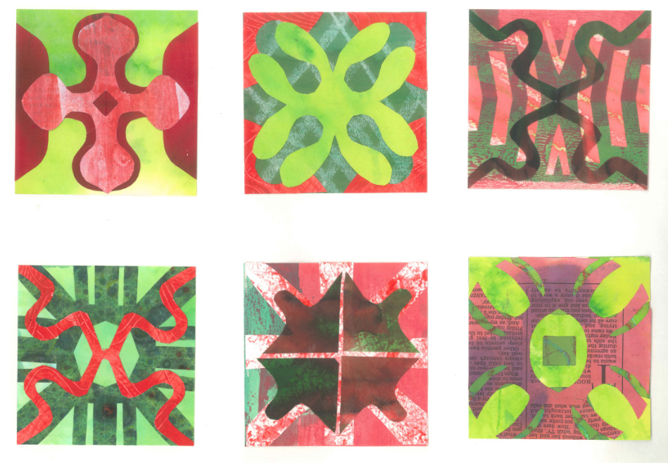
Top left: 
Background - lime green inked paper.
Middle - negative shapes left after cutting out No 2 (S) in dark red inked paper.
Top - No 1 (S) diamond cut out of the middle to break up the shape in red/white painted paper.

Top centre:
Background - green inked background lines drawn with a candle to create a resist.
Middle - negative shapes left after cutting out shape No 1 (S) - bright red water colour paper, dyed with Procion.
Top - No 9 (S) in lime green inked paper.

Top right: 
Background - light red painted paper.
Middle - No 25 (S) in green/red inked paper.
Top - No 7 (S) in dark green/red vellum.

Bottom left:
Background - mint green inked paper.
Middle - No 17 (S) in green marbled paper.
Top - No 7 (S) in red paper painted with Procion.

Bottom centre:
Background - green/red painted paper.
Middle - No 12 (S) in red/white sponged paper.
Top - No 6 (S) in red/green painted papers.

Bottom right: 
Background - green painted paper - not much of it is visible. 
Middle - No 2 (S) in lime green inked paper - centre square cut out.
Top - No 17 (S) in red painted newspaper.

My favourite two designs from this sheet are top right - I like the movement of the curvy lines and bottom centre - I find the mottled effect of the white/red sponged paper adds extra dimension to the design.


Sheet B

Top left:
Background - lime green inked paper.
Middle - No 9 but with wider lines in dark green marbled paper.
Top - No 12 (S) in red inked newsprint.

Top centre:
Background - red inked paper.
Middle - No 19 (S) in mint green inked paper.
Top - No 11 (S) - in green/red painted paper. 

Top right:
Background - pink paper - acrylic medium used as a resist. 
Middle - No 12 (S) in red painted paper.
Top - No 19 (S) in mint green inked paper.

Bottom left: 
Background - dark red painted paper.
Middle - No 23 (S) in red painted newspaper.
Top - No 19 (S) but cut wrongly (happy accident) in red/white painted paper.

Bottom centre:
Background - lime green inked paper.
Middle - No 25 (S) in red/green painted paper.
Top - No 11 (S) shape turned round in green marbled paper.

Bottom right:
Background - mint green inked paper.
Middle - No 20 (S) in red/green painted paper,
Top - No 12 but with diagonal lines only in red/white painted paper.

My favourite two designs from this sheet are top centre - a simple design but I think it looks nicely balanced and top right which is almost a more complex form of top centre. Both designs would work well in fabric and stitch.


Sheet C
Top left:
Background - red painted paper.
Middle - No 11 (S) in dark green marbled paper.
Top - No 16 (S) in pale green/white painted paper.

Top centre:
Background - mint green inked paper.
Middle - can't figure which design this is so can only imagine I have cut something the wrong way in dark green marbled paper. 
Top - No 8 (S) turned around in dark red painted paper.

Top right:
Background - red/green painted paper.
Middle - No 16 (S) offset to create asymmetry.
Top - No 11 (S) turned around and offset as above.

Bottom left:
Background - red/green painted paper.
Middle - No 11 (S) with larger hole in the centre in dark green inked paper.
Top - No 22 (S) in lime green inked paper.

Bottom centre:
Background - bright red painted paper.
Middle - offcuts from No 1 (S) in the corners in bright red painted paper.
Top - No 20 (S) in red/green painted papers.

Bottom right:
Background - lime green inked paper.
Middle - No 19 (S) offset and turned around to create asymmetry.
Top - No 1 (S) offset as above.

My favourite two designs from this sheet are top left - I can't really explain why but I do like the top shape and the colour scheme.  I am also pleased with bottom left - much more complex and gives the impression of more layers than there actually are.  I like the way the lattice design seems to float on the surface pushing the other layers into the distance.
  

Sheet D
Top left:
Background - pink/green painted paper.
Middle - offcuts from No 1 (S) offset to create asymmetry.
Top - No 1 (S) but cut thinner, halved then offset as above.

Top centre:
Background - mint green inked background.
Middle - No 2 (A) in green/red painted paper.
Top - No 1B (A) negative shape in dark red painted paper.

Top right: 
Background - mint green inked background.
Middle 1 - No 1B (A) negative shape in dark pink painted paper.
Middle 2 - No 1 (A) in light pink painted paper.
Top - No 1B (A) positive shape in dark red painted paper.

Bottom left:
Background - lime green inked paper.
Middle - offcuts from No 1 (S) offset to create asymmetry in bright red painted paper. 
Top - No 7 (S) in dark green painted paper offset as above.

Bottom centre: 
Background - lime green inked paper - not much visible.
Middle 1 - No 3 (A) centre not cut out in pink/white painted paper.
Middle 2 - No 1A positive shape in mint green inked paper.
Top - No 7 (A) in dark red inked paper.

Bottom right: 
Background - pale green/white painted paper.
Middle 1 - No 1 (A) in mint green inked paper.
Middle 2 - No 2 (A) in light green painted newspaper.
Middle 3 - No 1A (A) in dark pink painted paper.
Top - No 1B (A) but 2 lines left solid in light green painted paper.

My favourite two designs from this sheet are bottom centre and top right - both designs have lots of movement that remind me of windmill sails.  I feel they would both translate well into fabric and thread.

Although I can see that asymmetrical designs create more tension and movement, overall I prefer the symmetrical designs.  This may be because I like the sense of order and balance that is created by the symmetrical shapes or a symmetrical arrangement.  However, I would concede that the designs are more static and tend to be a bit predictable. 


Wednesday, 30 March 2016

Module 1 - Chapter 3 - Design development Based on the Star or Cross

I decided to change the shape I was working with and chose a more linear cross shape to ring the changes from my previous star/cross, which contained lots of sharp points and always seemed to create very spiky designs.  The new cross shape is an amalgam of several crosses from my research pages and the benefit of this new shape is it can be used in a square format or turned round to create diagonal patterns.
  

Design Sheet B1


1.  Small unit inside the negative space formed by an arrangement of four larger units.
2.  Pattern using large and small units - I made another simplified smaller unit by removing some of the 'steps' in the original shape.  I kept the small version of the original shape in the centre of this design and used the simplified shapes in the corners.
3.  Border and corner design - large unit plus an outline of the simplified shape.
4.  Alternative border and corner design - overlaid simplified unit on top of original shape then alternated with outline shape.  I also used small square off-cuts as spacers to add another element to the design.


Design Sheet B2


1. Two designs showing shapes interlinked - outline of square added.
2.  Border pattern using the original shape and outline of same shape - creates a chain effect.
3.  New shapes from old - I really enjoyed creating this design as I like the 'patchwork quilt block' effect that has emerged.  I had some odd spaces so added the reduced original shape and simplified shape to fill in the gaps.


Design Sheet C1


1.  Complex counterchange.  New motif  highlighted in red.
2.  Alternative complex counterchange design.
3  Divide and separate - I like the linear effect that the spaces create.
4. Border pattern using two new motifs interlinked to create a new unit with top row turned upside down.  Although I like the the new unit, when repeated it creates a design with too much open space.  
5.  Border pattern created with new motifs overlapped. Design could be further developed by turning the motifs back to back and continuing the border in the opposite direction.
6.  Two of the new units arranged to form a new cross shape. I really like this.
7.  Another interlinked pattern using two shades of green. This is quite a subtle design but I like the sense of movement and the pinwheel shape that appears in the centre of the repeats.


Design Sheet C2


Repeat patterns using new motif.  I like both patterns but prefer the one on the left and feel it could translate into an attractive applique design.  The right hand design has produced small squares that appear to float on the surface, an effect which was completely unexpected.


Templates Used in this Chapter


 Extras

I had cut some paper shapes that I chose not to use within the chapter.  However, I didn't want to throw them away so I have arranged them here in a repeating pattern to use them up.  The shape was my original star/cross with the short points removed.

Closing Thoughts

I feel I made heavy weather of this chapter and probably spent too much time on it.  However, once I got my head round the 'shape within a shape' section, I really began to enjoy myself and felt I was making progress as ideas began to flow.  I could have developed some designs further but with this method of designing you can go on forever and sometimes it's difficult to know when to stop.  I am now looking forward to chapter four and the new challenge I am sure it will bring!


Friday, 18 March 2016

Module 1 - Chapter 3 - Design Development

The cross shape I have used for these designs comes from page 4 of my crosses research and from my line drawing on page 1.  I like the fact that although the shape is essentially a cross, it resembles a star because of the diagonal points, so I feel I have the best of both worlds.


Design Sheet A1


1.  Counterchange.
2.  Four shapes in alternate colours placed edge to edge to create Interchange.  A new star shape is created in the centre where the shapes meet.  However, I feel the star is too regular to develop further.
3.  Lines of symmetry shown.
4.  Shape distorted by altering the grid.  Shape formed is more rectangular and is symmetrical in only one direction (line of symmetry shown).  I feel this elongated star is a more interesting shape than the original and may be worth exploring further at some point.
5.  Counterchange - rectangular star shape.


Design Sheet A2


1.  Shape is further distorted by altering the grid in both directions to create a completely asymmetrical shape.  
2.  Four shapes are placed on the diagonal.  In this position the shapes look like butterflies and a small diamond shape is formed in the centre.
3.  Two shapes placed back to back with long points facing inwards, which creates a double pointed star in the centre.  I really like this shape and feel it may have some potential for developing further. I intend to make a template of this shape and explore its possibilities.


Design Sheet A3


1. I returned to the rectangular star shape and placed four together (Interchange) to see what shape would be formed in the centre.  I like the fact that the new shape has lost something of the 'cross/star look' and is a definite diamond shape - may well be worth a second look.
2.  I then arranged four more shapes with the smaller points facing inwards and an X shaped cross emerged.  I love this method of designing as there are so many surprises in the negative space.  


Design Sheet A4


1.  (Counterchange)  I had lots of cut outs left over from the original shape so I went back to playing with it and decided to change the orientation of the shape by moving it a quarter turn.  It now looks completely different to the original and has a more square, compact look, which I think I prefer.
2.  Four shapes together in contrasting colours (Interchange).  This is a much less open design than the original, therefore the centre shape is smaller - a very defined cross shape but as each part is completely separate it couldn't be cut out as one shape unless adapted in some way.
3.  Four shapes arranged as above but moved apart slightly and edges drawn in to complete the cross shape.  Again, I really like this shape but maybe it is a little too complex with the double points and could end up looking too 'spiky' or busy.  However, I think the double points give the shape some movement and that this could possibly be exploited through clever use of colour.  I will probably come back to this at some stage and experiment with different colour/tonal combinations and see if there is any mileage in this idea.


Design Sheet A5


For each of the 'shapes within a shape' I have shown how the shape looks when placed within a frame and I really like the effect this creates as it adds another dimension that can be explored. It also shows how the original shape sits within its new background shape and whether any distortion occurs.

1.  Original shape in a diamond (square on point).  The original shape doesn't distort.
2.  Original shape in a circle - the only distortion is that the points become curved on the outside edge.
3.  Original shape moved a quarter turn as shown in Design Sheet A4 - shape doesn't distort.
4.  Original shape in an equilateral triangle.  The shape has distorted a lot from the original but I think it looks like a plane or a rocket and I'm not sure I like it.  It does work better when enclosed within a frame but I don't think I will take this any further.
5.  'Plane' shapes arranged with long points meeting in the centre.  This create a hexagon (six equilateral triangles) but again I don't like it - looks too spiky!


Design Sheet A6


1.  Original shape in a long diamond.  Shape is stretched lengthwise and creates a more interesting cross shape than the original.
2.  Stretched shape in a frame.
3.  Stretched shape in a frame - halved across the middle and the two halves re-arranged.  I like this shape because of the irregular interior.
4.  Four stretched shapes in frames joined together to form a larger diamond.  I really like this design - reminds me of trellis.
5.  Another four stretched shapes joined together to form another large diamond.  This arrangement is more open than the other one because there are no frames to contain the shapes.  I also like this design but still prefer the large diamond with the frames.
6.  Shape formed by removing the long points from the diamond - may have possibilities?


Tuesday, 15 March 2016

Module 1 - Chapter 3 - Design Development Based on the Star or the Cross


Before I can begin this chapter I need to paint some more papers.  This is because I had all but given up on the course due to a combination of personal circumstances, and as a result had thrown my painted papers away.  However, those problems have now been resolved and I feel ready to get back on track and have another go!  


The new papers I have created use the same 'Brusho' ink colours I used before with the addition of a little black.  The variety of papers I have chosen are also very similar to those used previously, but this time I have added in some hand marbled papers and some thick tracing paper.  


I decided to stick with the red and green complementary colour scheme I had originally chosen so that there is some continuity in my work throughout the module.


Here are swatches of the new red and green papers.


1. Red Papers


2. Green Papers


Papers include cartridge paper, tissue, water colour paper, tracing paper, marbled paper, newsprint and printer paper.


Wednesday, 22 January 2014

Module One - Chapter Two - Printing Crosses

Here are the prints I created from my cross shapes. Initially I used a shape which I found in the tracings I made from the guitar photographs (shape adapted from bottom right hand corner tracing in blog on asymmetrical designs).  I made two large stamps - the shape and its mirror image using 'funky foam'.  Although this shape is asymmetrical, it does not rotate or reflect well as both sides are quite similar.  I was disappointed that the shapes did not yield more varied patterns but I did find the overall effect of the prints interesting, probably because I like the colour combinations and the way I could easily mix and blend the paint colours.


I then decided to change tack and look for a shape that would generate a greater variety of patterns.  
This shape came from one of my cross drawings - see first page of line drawings (design from The Internet) and again I created two stamps (much smaller this time) of the shape and its mirror image.  Although the shape is very simple, I knew it would produce a nice range of secondary patterns when rotated and reflected.  I particularly like the sharpness of these designs which was achieved by using a selection of ink pads used in rubber stamping.


Shape printed in same direction in rows

Alternate rows turned upside down

Shape and its mirror image - alternate rows reflected
and using two colours in the background.

Shapes reflected, rows offset and printed on a slight angle

Shape repeated in same orientation on painted newsprint

Pairs of shapes, one upside down and  printed back to back

Shape and mirror image repeated in rows to create an M shape

Mirror image reflected in alternate rows

Squares printed with ink pads then shapes printed
mirror image in the corners of each square.
I think it creates the effect of stars.

Shape repeated in a circle then overlapped. Reminds
me of the symbol of The Isle of Man.

Alternate rows upside down and shapes
fitted into the gaps from the previous row.
 I like the diagonal lines created by this design.

Design printed onto painted tissue paper.  Shape and its
mirror image slightly offset, which created an N shape


Finally I created a page of  'cross shapes' taken from a selection of my cross drawings.  Some are very simple, others are more complex, being a combination of different shapes layered together.


Thursday, 1 November 2012

Painted Papers

I chose two different Brusho greens - Leaf Green and Emerald but as I found them to be fairly similar I added Lemon so I could mix more of a lime green.


The reds I used were Scarlet and Brilliant Red.  Again, I found them to be similar so I diluted Scarlet by 100% and also mixed 1 part scarlet and 1 part Brilliant Red.  I'm not sure why this combination has come out much darker than the two individual colours - I think I might have added a little more Brilliant Red powder to strengthen the mix.


I then began painting a selection of papers including newsprint, tissue, cartridge, brown paper etc and I thoroughly enjoyed myself! I'm afraid I found it too frustrating to try and record what I was doing as I was having too much fun, but I made sure I painted lots of papers in good quantities so I feel I have plenty to work with. I worked spontaneously with the colours and the papers and I know I would not have painted so many if I had had to keep stopping to write up recipes and methods.

I have cut strips and sandwiched them together to show the range of papers I have created.  Some of the techniques I have used include painting with a sponge brush, sponging, spraying with water, sandwiching wet papers together to transfer colours, and painting a second colour on top of the first colour after it has dried.


I think I have a wide enough range of colours and effects and I am now looking forward to printing on them and cutting them up.