Saturday, 27 October 2012

Asymmetrical Cross Shapes

Module 1 - Chapter 2

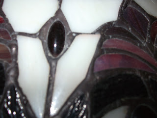
1 & 2 Details from a Tiffany lamp shade


3.  Crossed kitchen utensils


As part of her feedback Sian asked me to find or contrive some more asymmetrical cross shapes.  I photographed details from a Tiffany lampshade and laid out some kitchen utensils on the floor but these did not inspire me.

Then I spotted my husband's guitar propped against the wall!

Here were lots of previously 'unnoticed crosses', so I grabbed my camera and photographed sections of the guitar from unusual angles and created a collage of the results.

4.  Guitar collage


I really liked these images so I traced and simplified the individual sections to see what 'crosses' I had discovered.    

5.  Tracings from collage
                   

I have decided to run with the shapes in the bottom, right hand image and after I paint some papers, my next task will be to create a stamp from this design.



Brainstorm - Cross Shapes

Module 1 - Chapter 2


1.  Words/expressions relating to crosses


2. Why crosses and where?


I actually created these pages at the outset of the module but didn't think to photograph them to put on the blog.  As I am now closely analysing my crosses to select the shapes that are most suitable for stamping and printing, I thought it would be appropriate to include them here.  These were my initial thoughts about crosses - words, expressions, why crosses rather than stars and finally sources of cross shapes.

Friday, 26 October 2012

A Weaving in Red and Green

Module 1 - Chapter 2

We have been doing a lot of decorating recently and as a result have accumulated a large quantity of paint colour charts.  Rather than throw them away I decided to cut out strips from the red and green sections and weave them together.  I really like the effect and feel there is scope for further experimentation e.g. greater variety in the width of the strips, incorporating plain and patterned strips, allowing one colour to dominate more, increase the range of shades and tints of each colour, one colour only in each direction.... and so on....................lots of possibilities I think!

A Visual Feast


Module 1 - Chapter 2


I was pottering in my garden today and suddenly noticed the amazing range of red/green leaves on my Hydrangea bush, so I picked some of the prettiest leaves to photograph. I just love the mix of bright raspberry pinks through to the deepest plum tones and the greens which almost look rusty with the addition of red.  What a feast for the eyes!


My Favourite Complementary Colours

Module 1 - Chapter 2


I have chosen to work with red and green as this is my favourite pair of complementary colours. These are the classic Christmas colours - fir trees, ivy, poinsettias and holly bushes heavy with glossy red berries or the blood red roses, carnations and variegated geraniums of summertime.  Tomatoes, peppers, salad leaves, rosy apples, raspberries, strawberries and fiery chillies bring red and green to the table.  Here is a collage to illustrate red and green.  It contains hand painted papers, magazine images, scrapbooking papers, paint swatches and photographs.

Complementary Colours


Module 1 - Chapter 1


Vibration is the visual phenomenon caused by using complementary colours in equal quantities and usually occurs at the point where the colours meet.  It is an unsettling effect where the eye becomes confused and does not know which colour to focus on and because of this the colours can appear to move (vibrate).  It is better therefore to allow one colour to dominate the scheme and use less of its complement.

I painted swatches of yellow/purple, green/red and orange/blue.  The swatches on the top row show the colours edge to edge in equal quantities to demonstrate vibration. In the centre row the lighter colours have been painted in the larger squares, whereas in the bottom row the lighter colours have been painted in the smaller squares.  

I prefer the swatches in the bottom row where the darker colours dominate, possibly because they possess greater visual weight and seem more balanced and pleasing to the eye - well to my eye anyway!

Complementary Colours

Module 1 - Chapter 1


I have painted pairs of complementary colours - yellow/purple, red/green and blue/orange and blended each pair together in the middle. When  complements are mixed together they create dark neutral greys which look more natural and less dirty than greys made by adding black.