Chapter Four - Cut and Fold Paper
Coloured Designs
I really enjoyed this exercise and felt I could have gone on forever. I find it really therapeutic cutting out and arranging paper shapes as it is fascinating to explore the variety of designs and combinations that can be created with just a handful of paper cut outs. However, in the interests of moving on to fabric and thread, I decided to stop after four sheets as I feel I am spending too much time on each chapter.
Unfortunately, I forgot to number each design before scanning the sheets in. As these sheets are A3 I needed to scan them at work, but it was only after I brought my sketchbook home I released I had omitted the numbers. As an alternative, I have listed the position of the designs on each sheet so they can be easily identified.
I have also described and referenced the individual layers of each design as follows:
- Background
- Middle - numbered according to the original sheet it appeared on. (S) = Symmetrical (A) = Asymmetrical
- Top numbered as above
I prefer to work this way - detailing what I have done on my blog rather than handwriting the information on my sketchbook pages.
Sheet A
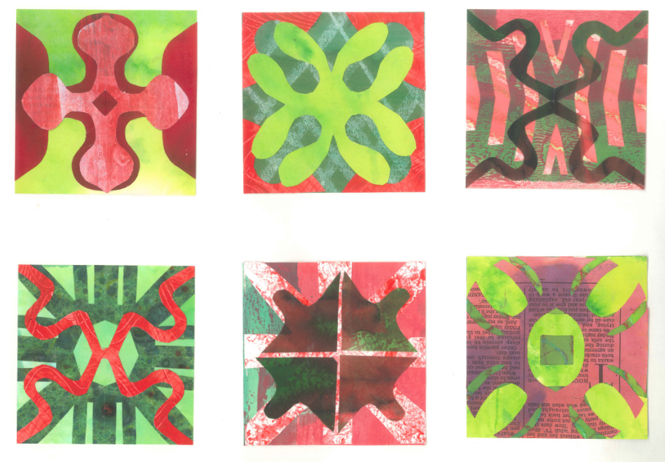
Top left:
Background - lime green inked paper.
Middle - negative shapes left after cutting out No 2 (S) in dark red inked paper.
Top - No 1 (S) diamond cut out of the middle to break up the shape in red/white painted paper.
Top centre:
Background - green inked background lines drawn with a candle to create a resist.
Middle - negative shapes left after cutting out shape No 1 (S) - bright red water colour paper, dyed with Procion.
Top - No 9 (S) in lime green inked paper.
Top right:
Background - light red painted paper.
Middle - No 25 (S) in green/red inked paper.
Top - No 7 (S) in dark green/red vellum.
Bottom left:
Background - mint green inked paper.
Middle - No 17 (S) in green marbled paper.
Top - No 7 (S) in red paper painted with Procion.
Bottom centre:
Background - green/red painted paper.
Middle - No 12 (S) in red/white sponged paper.
Top - No 6 (S) in red/green painted papers.
Bottom right:
Background - green painted paper - not much of it is visible.
Middle - No 2 (S) in lime green inked paper - centre square cut out.
Top - No 17 (S) in red painted newspaper.
My favourite two designs from this sheet are top right - I like the movement of the curvy lines and bottom centre - I find the mottled effect of the white/red sponged paper adds extra dimension to the design.
Sheet B

Top left:
Background - lime green inked paper.
Middle - No 9 but with wider lines in dark green marbled paper.
Top - No 12 (S) in red inked newsprint.
Top centre:
Background - red inked paper.
Middle - No 19 (S) in mint green inked paper.
Top - No 11 (S) - in green/red painted paper.
Top right:
Background - pink paper - acrylic medium used as a resist.
Middle - No 12 (S) in red painted paper.
Top - No 19 (S) in mint green inked paper.
Bottom left:
Background - dark red painted paper.
Middle - No 23 (S) in red painted newspaper.
Top - No 19 (S) but cut wrongly (happy accident) in red/white painted paper.
Bottom centre:
Background - lime green inked paper.
Middle - No 25 (S) in red/green painted paper.
Top - No 11 (S) shape turned round in green marbled paper.
Bottom right:
Background - mint green inked paper.
Middle - No 20 (S) in red/green painted paper,
Top - No 12 but with diagonal lines only in red/white painted paper.
My favourite two designs from this sheet are top centre - a simple design but I think it looks nicely balanced and top right which is almost a more complex form of top centre. Both designs would work well in fabric and stitch.
Sheet C

Top left:
Background - red painted paper.
Middle - No 11 (S) in dark green marbled paper.
Top - No 16 (S) in pale green/white painted paper.
Top centre:
Background - mint green inked paper.
Middle - can't figure which design this is so can only imagine I have cut something the wrong way in dark green marbled paper.
Top - No 8 (S) turned around in dark red painted paper.
Top right:
Background - red/green painted paper.
Middle - No 16 (S) offset to create asymmetry.
Top - No 11 (S) turned around and offset as above.
Bottom left:
Background - red/green painted paper.
Middle - No 11 (S) with larger hole in the centre in dark green inked paper.
Top - No 22 (S) in lime green inked paper.
Bottom centre:
Background - bright red painted paper.
Middle - offcuts from No 1 (S) in the corners in bright red painted paper.
Top - No 20 (S) in red/green painted papers.
Bottom right:
Background - lime green inked paper.
Middle - No 19 (S) offset and turned around to create asymmetry.
Top - No 1 (S) offset as above.
My favourite two designs from this sheet are top left - I can't really explain why but I do like the top shape and the colour scheme. I am also pleased with bottom left - much more complex and gives the impression of more layers than there actually are. I like the way the lattice design seems to float on the surface pushing the other layers into the distance.
Sheet D

Top left:
Background - pink/green painted paper.
Middle - offcuts from No 1 (S) offset to create asymmetry.
Top - No 1 (S) but cut thinner, halved then offset as above.
Top centre:
Background - mint green inked background.
Middle - No 2 (A) in green/red painted paper.
Top - No 1B (A) negative shape in dark red painted paper.
Top right:
Background - mint green inked background.
Middle 1 - No 1B (A) negative shape in dark pink painted paper.
Middle 2 - No 1 (A) in light pink painted paper.
Top - No 1B (A) positive shape in dark red painted paper.
Bottom left:
Background - lime green inked paper.
Middle - offcuts from No 1 (S) offset to create asymmetry in bright red painted paper.
Top - No 7 (S) in dark green painted paper offset as above.
Bottom centre:
Background - lime green inked paper - not much visible.
Middle 1 - No 3 (A) centre not cut out in pink/white painted paper.
Middle 2 - No 1A positive shape in mint green inked paper.
Top - No 7 (A) in dark red inked paper.
Bottom right:
Background - pale green/white painted paper.
Middle 1 - No 1 (A) in mint green inked paper.
Middle 2 - No 2 (A) in light green painted newspaper.
Middle 3 - No 1A (A) in dark pink painted paper.
Top - No 1B (A) but 2 lines left solid in light green painted paper.
My favourite two designs from this sheet are bottom centre and top right - both designs have lots of movement that remind me of windmill sails. I feel they would both translate well into fabric and thread.
Although I can see that asymmetrical designs create more tension and movement, overall I prefer the symmetrical designs. This may be because I like the sense of order and balance that is created by the symmetrical shapes or a symmetrical arrangement. However, I would concede that the designs are more static and tend to be a bit predictable.
No comments:
Post a Comment